Avenor. A considered place to call home.
Designing a real estate website that brings architectural character and practical information together, helping prospective buyers explore homes, understand their options, and take the next step towards an enquiry.
Overview
Avenor presents residential developments through architecture, space, and everyday living. I designed the website to express that identity while giving prospective buyers a clear path through apartment layouts, project locations, and enquiries.
- Year
- 2026
- Industry
- Real Estate
- Platform
- Website
- Scope
- UI/UX · Visual Design
- Timeline
- To be confirmed
Challenges
Balance aspiration with information.
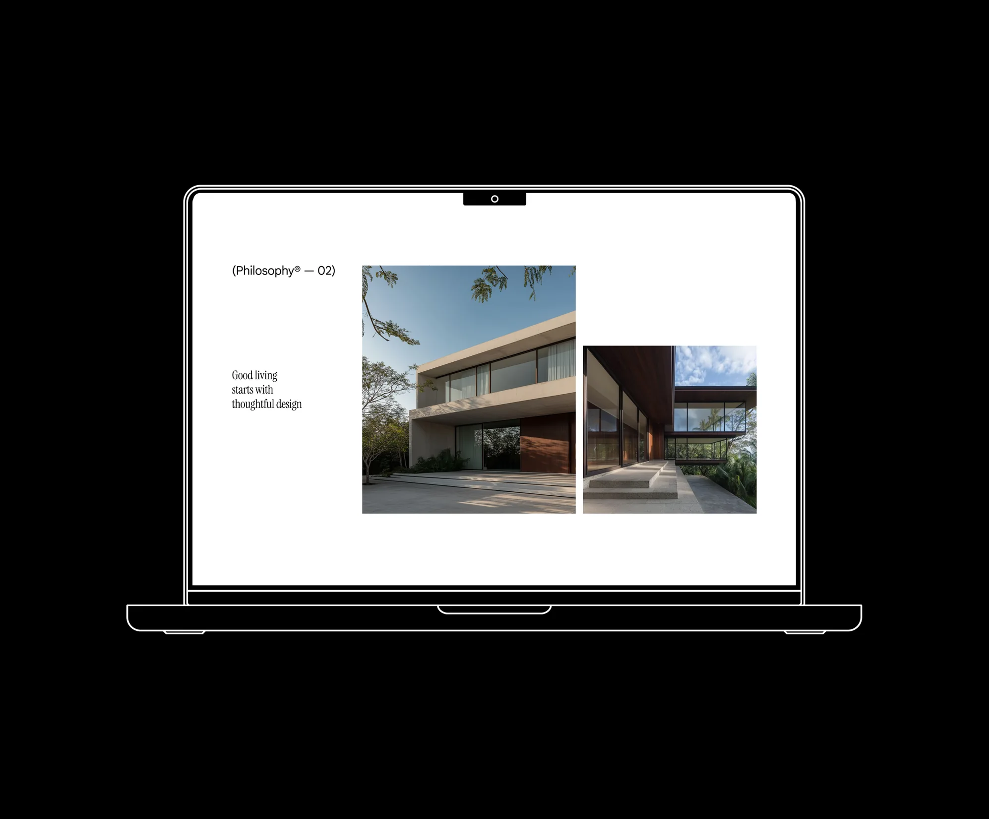
The website needed to communicate the quality of the homes while supporting practical decisions. Architectural imagery had to sit alongside floor plans, locations, and contact details without making the experience feel crowded.
- Establish a distinctive identity through imagery and typography.
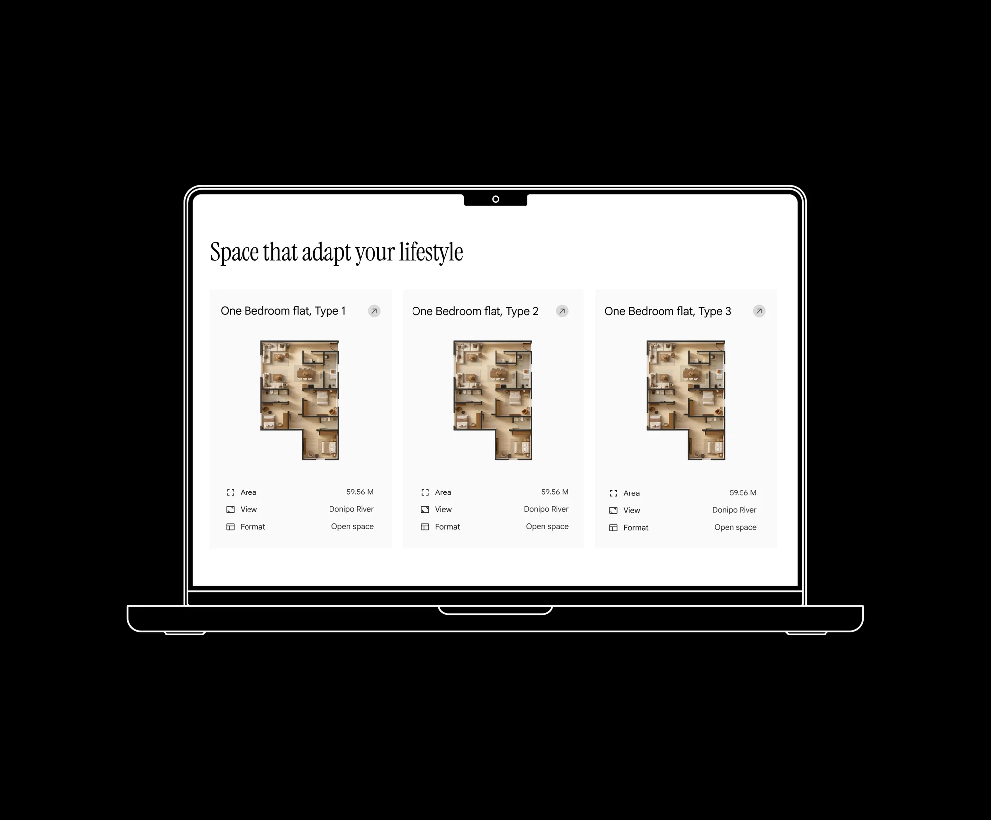
- Make apartment options easy to scan and compare.
- Connect property exploration with a clear enquiry path.
Solution & result
Let the architecture lead.
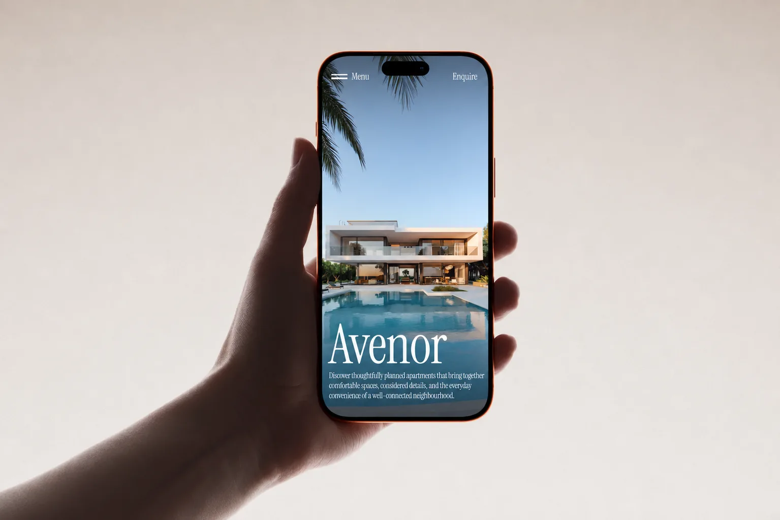
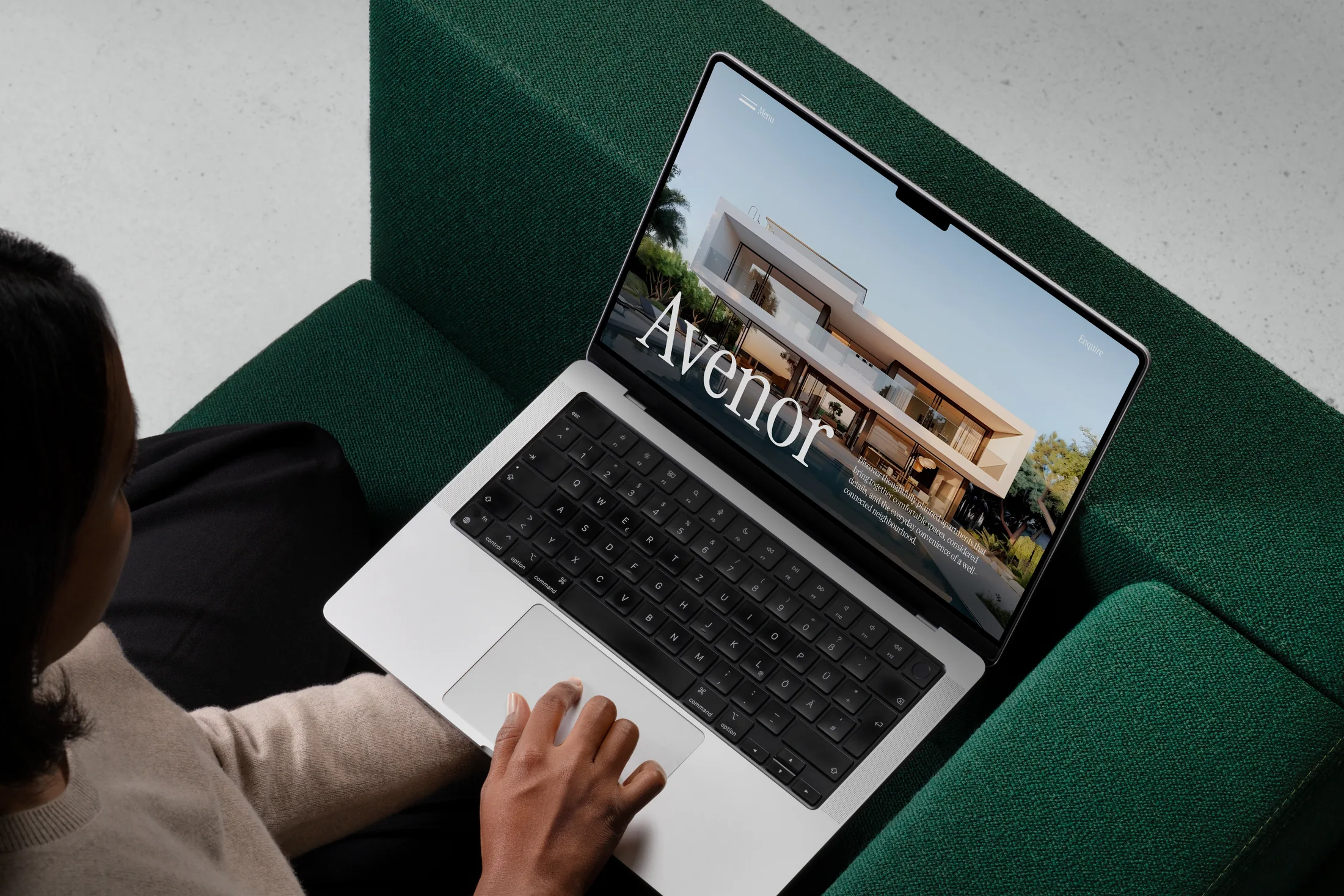
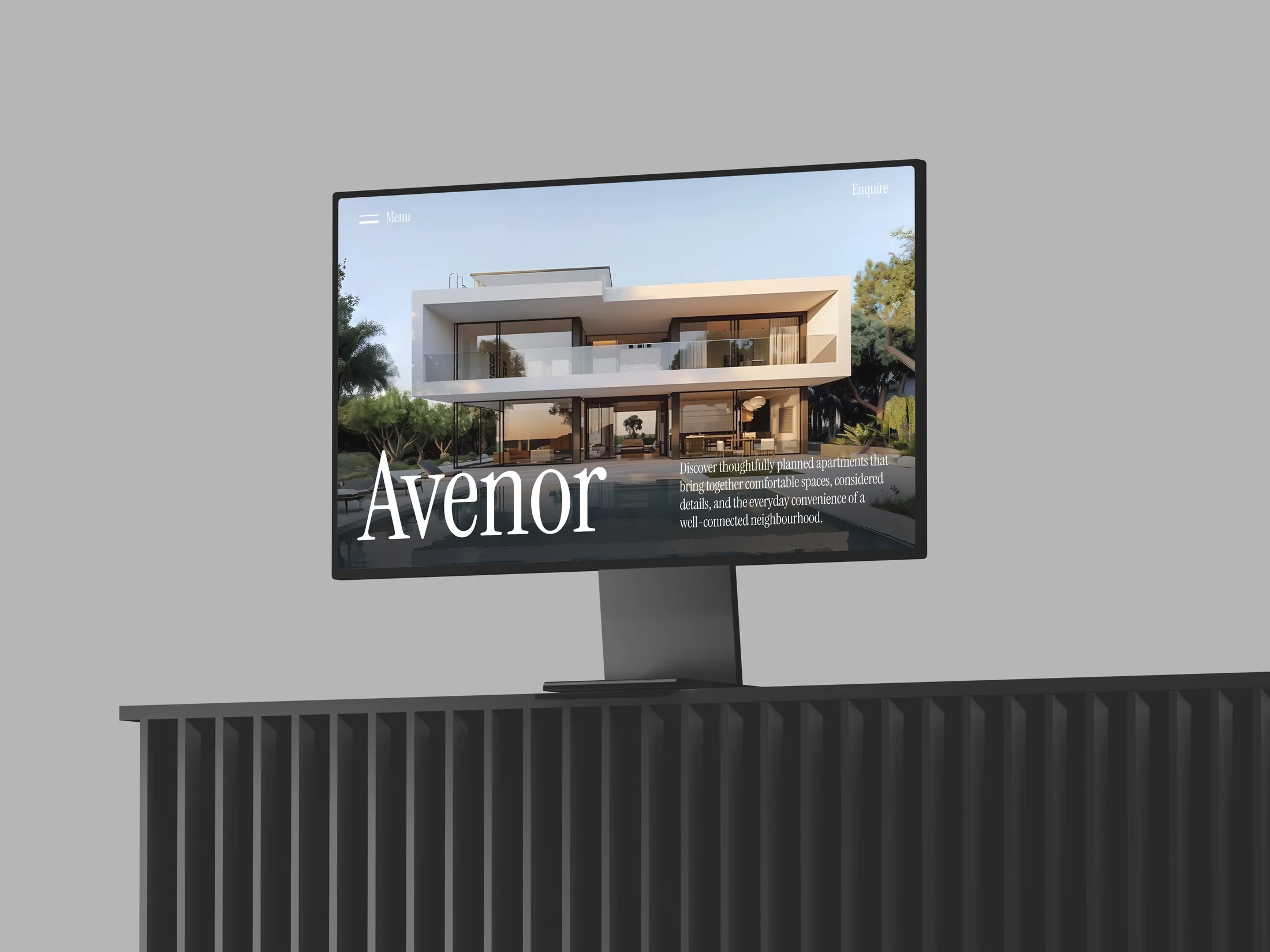
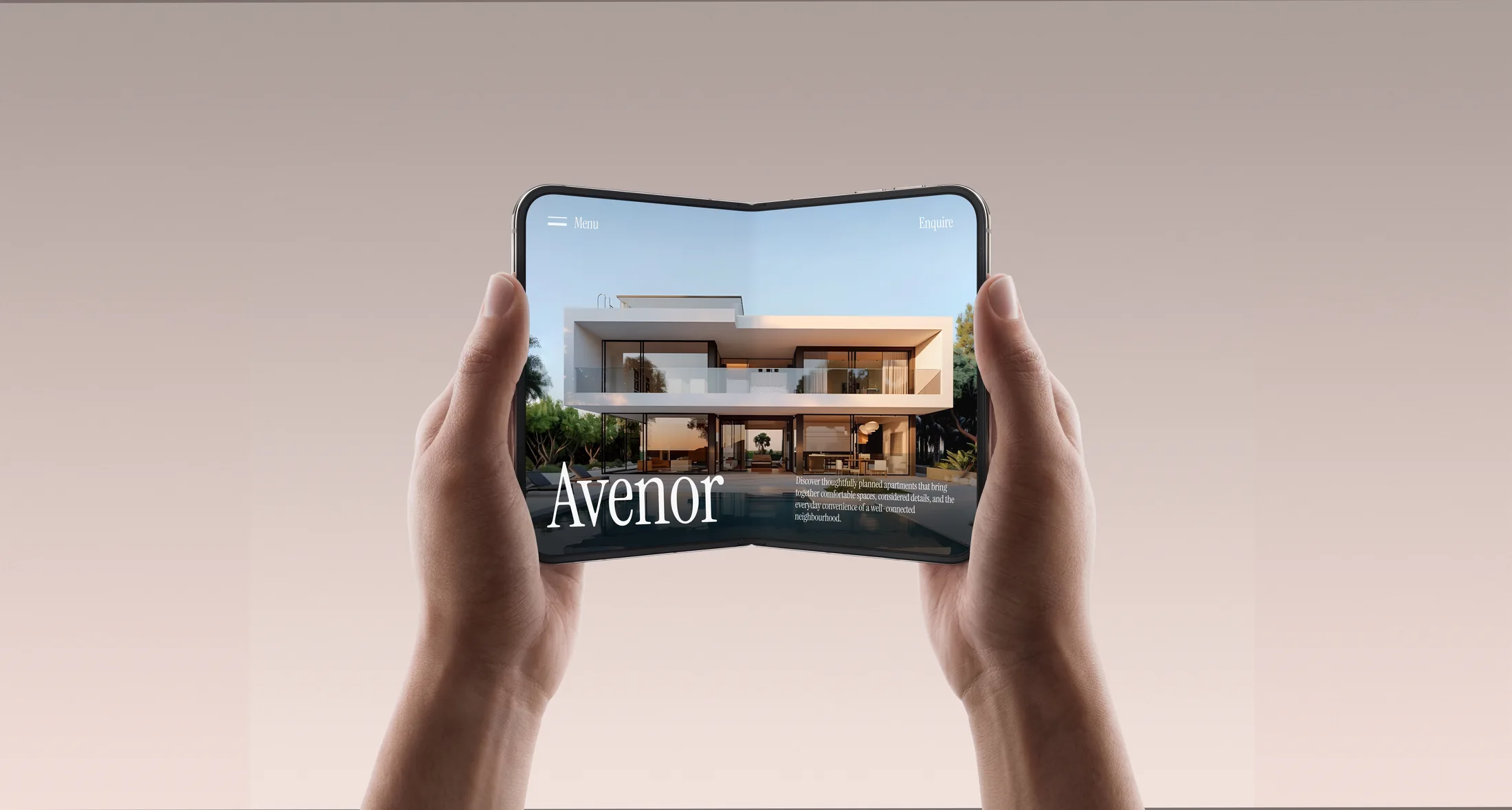
A full-width architectural image establishes the first impression, paired with oversized serif typography and minimal navigation. The composition gives the property prominence while introducing Avenor with a confident, restrained visual identity.
Bring the details into focus.
Consistent apartment cards bring floor plans and key specifications into one repeatable format. A dedicated location map adds geographical context, connecting individual homes with the wider collection of projects.
Make the next step clear.
A contrasting contact section creates a distinct point of action within the page. A short enquiry form and focused FAQs address practical questions about locations, floor plans, visits, and booking.
One coherent property story.
The final design brings brand introduction, property exploration, and enquiry into a single page. Its visual system carries the architectural character throughout, creating a complete website concept ready for prototyping and testing.
- 3 apartment cards establish a consistent comparison format.
- 3 enquiry fields keep the contact form focused.
- 4 FAQs address key questions before contacting the team.
These figures describe the design scope. Conversion results and the business statistics displayed in the mockup have not been verified.