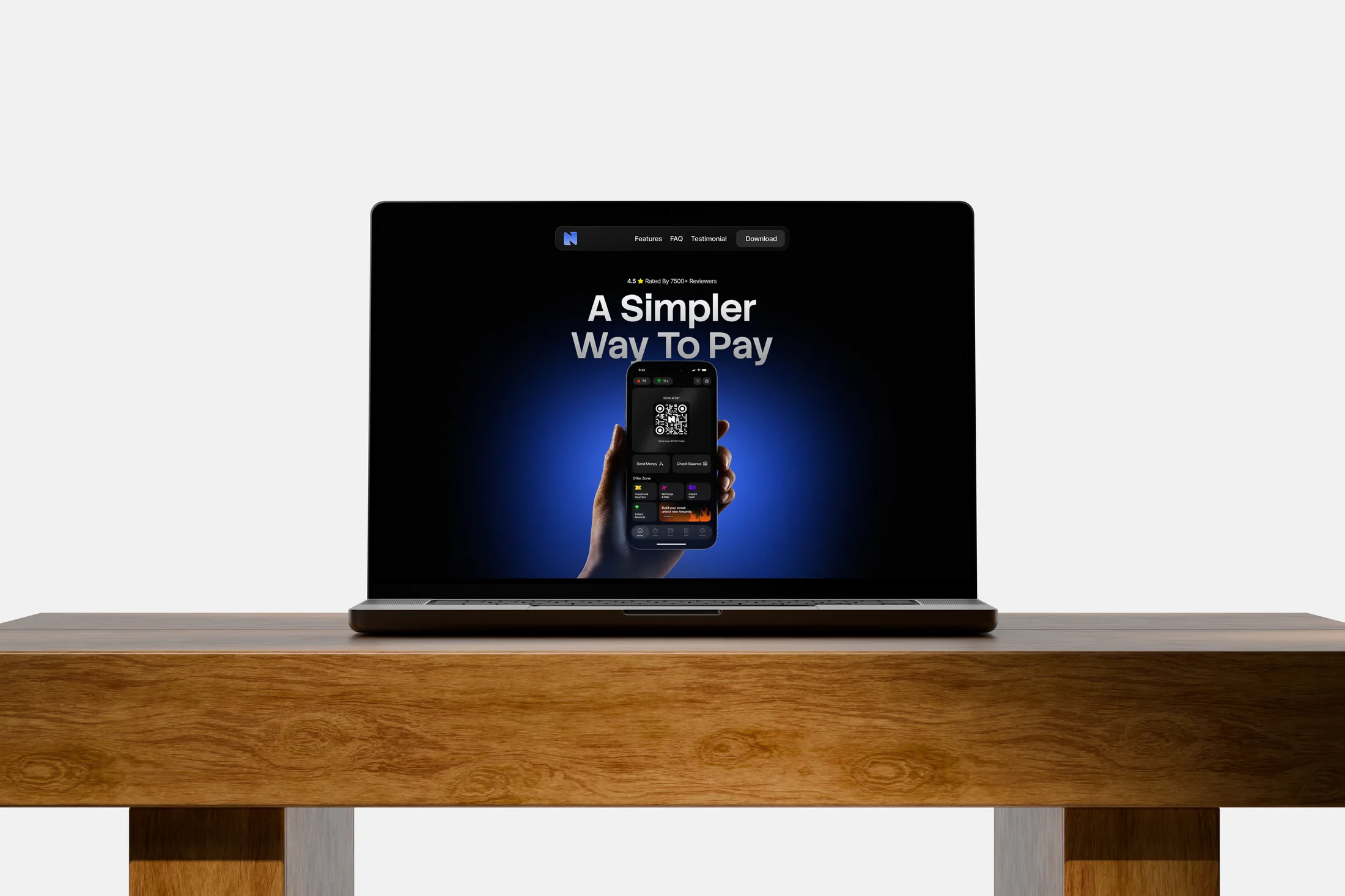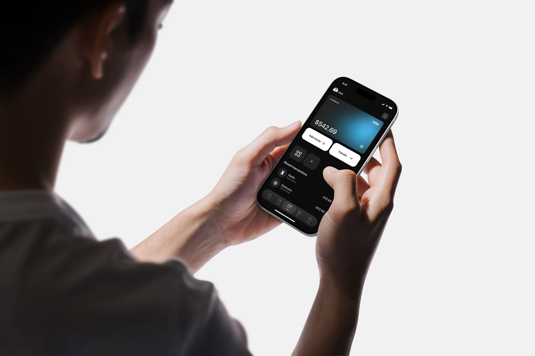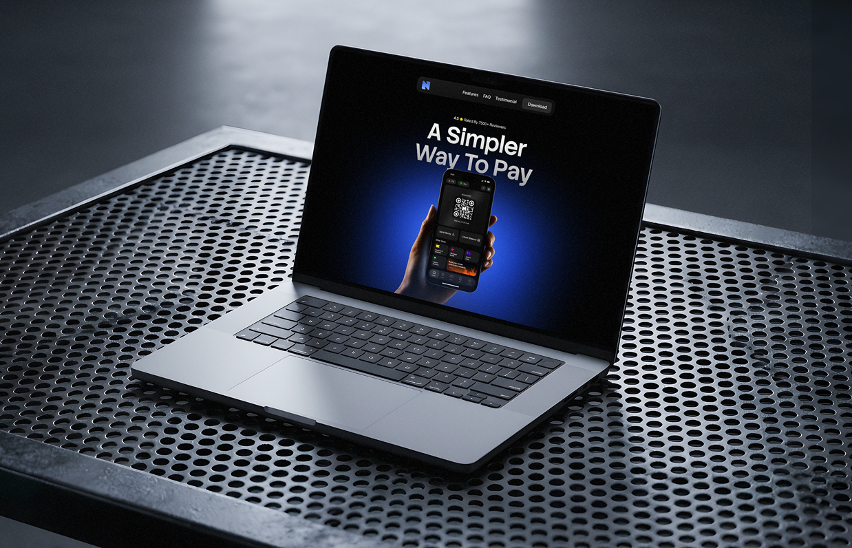
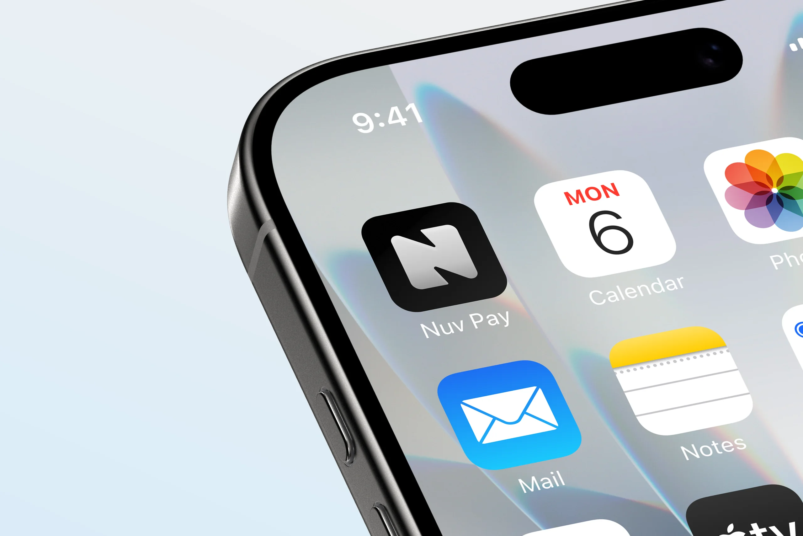
Nuv Pay. Pay Simple
A payment app concept built around everyday tasks, bringing QR payments, cards, bills, and rewards into a clear interface that keeps the next action easy to find.
Overview
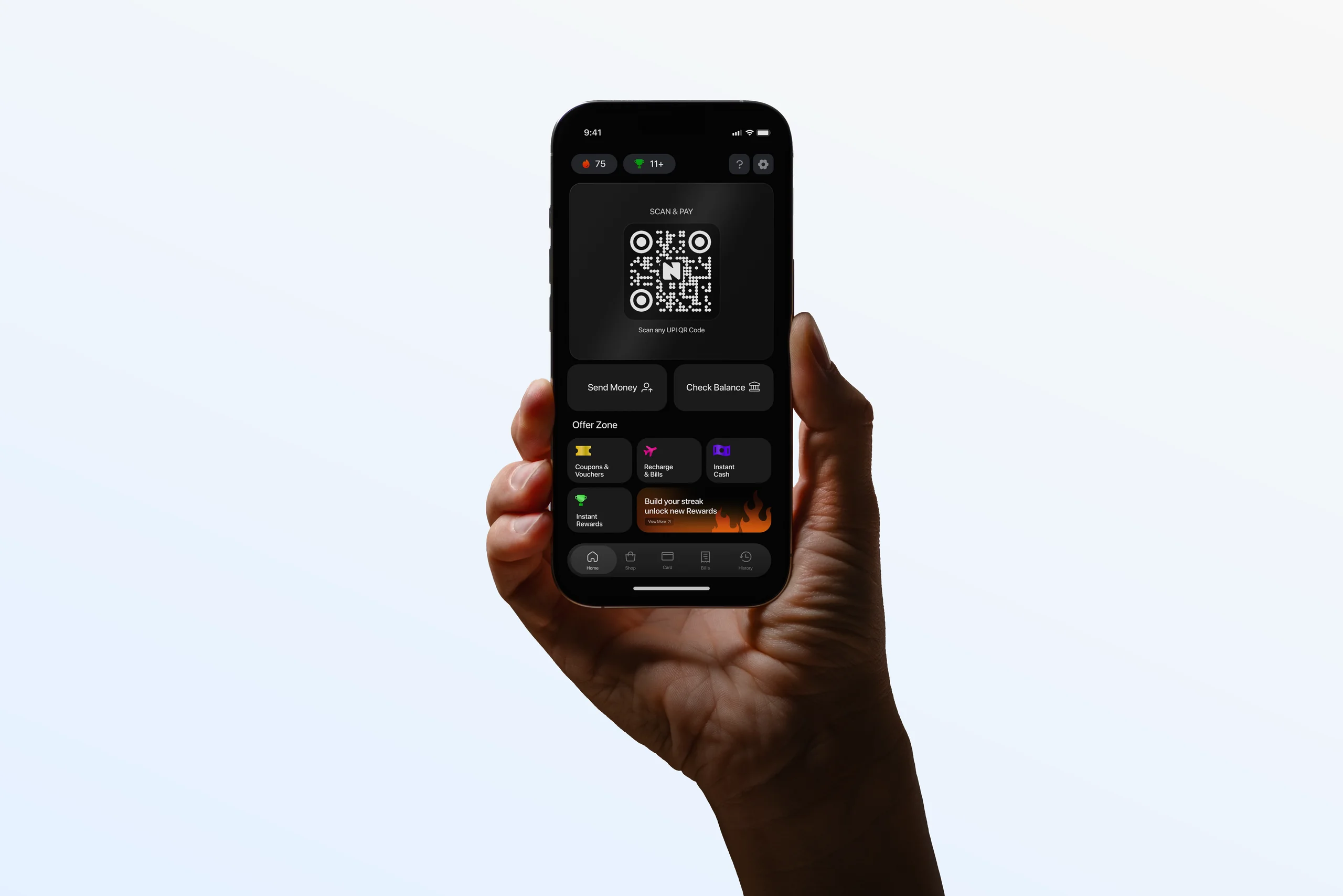
Nuv Pay started with a simple idea: make everyday payments feel less crowded. I designed a mobile app concept that puts scanning and paying first, while keeping other useful features within reach.
- Year
- 2026
- Industry
- Fintech · Digital Payments
- Platform
- Mobile app
- Scope
- UI/UX design · Visual design system
- Timeline
- To be confirmed
Challenges
The main challenge was balancing a focused payment experience with features like rewards, bills, and card offers. Each needed space without competing with the action people came for: making a payment.
- Keep Scan & Pay easy to find.
- Give payments and promotions a clear hierarchy.
- Make transaction details readable within a dark interface.
Solution & result
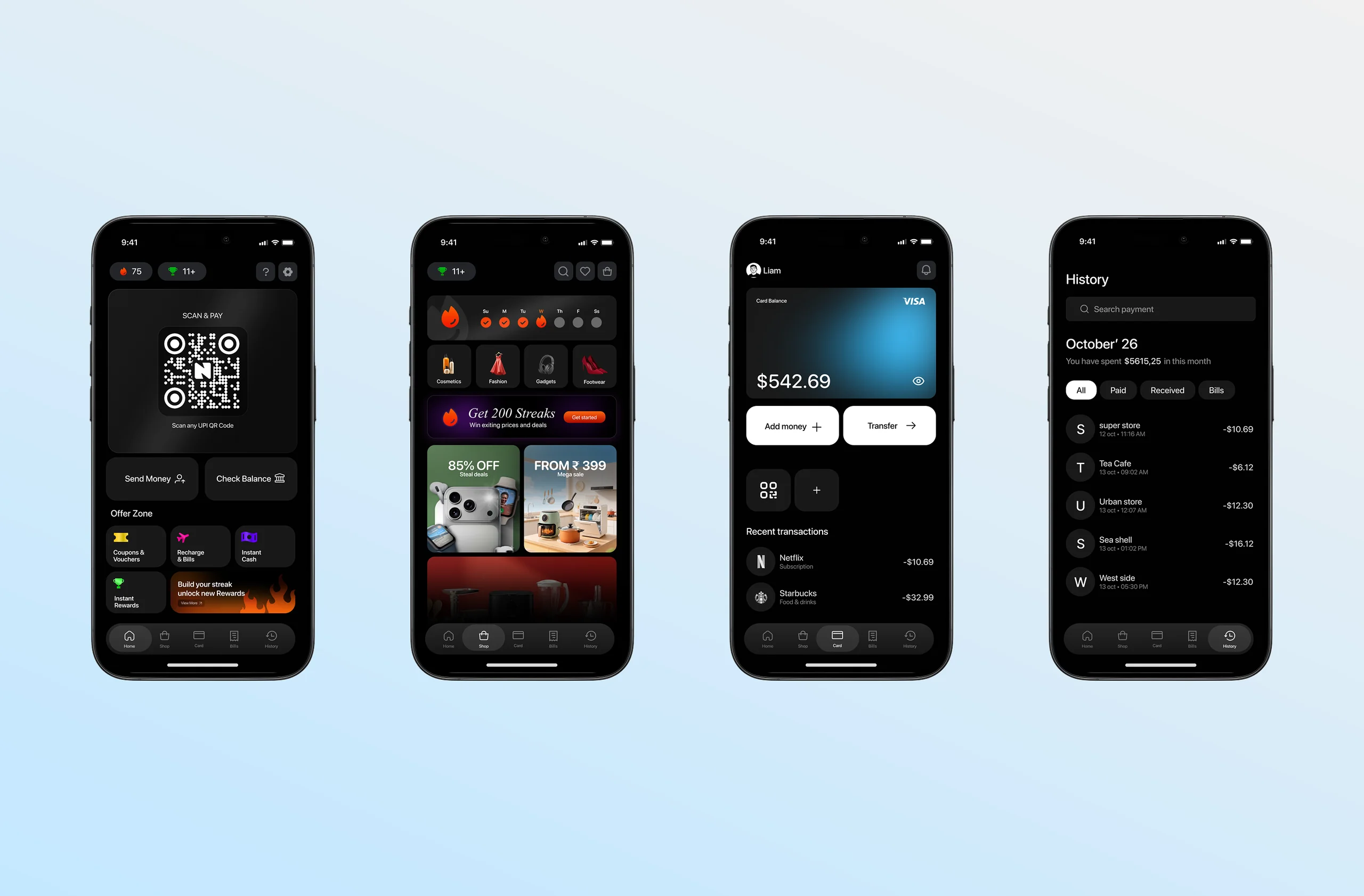
I organised the experience into five main sections and used a consistent card system to group information. Blue accents highlight key actions, while spacing and typography help separate payments, balances, and rewards.
- 5 main sections: Home, Shop, Cards, Bills, and History.
- 1 core journey: Open → Scan → Pay → Done.
- 1 shared visual system: Reusable cards, colours, typography, and icons.
The result is a UI concept that gives payments a clear starting point and supporting features their own space. Usability testing would be the next step to assess speed and clarity.